Monday, December 13, 2010

Entertaining for the Holiday's...How to make the most of it..


What a way to create such a dramatic entrance for the holiday's!! Now though this is strong a statement, you may not want to have fragile ornaments on stairs especially once the bubbly has been poured. Without a doubt, its an exciting image that you'll never forget...makes you jealous doesn't it?

With that thought in mind...Entertaining for the holidays is usually a great way to exhibit your skills in the kitchen, and with decor, by hosting with hopes to create a wonderful memorable experience with those you love.To begin we need to sit down and grab a pen and paper and jot down a few things:

  • When entertaining you need to figure out what it is that you want to showcase, and how you plan to do so. Begin with the theme, number of guest, and the menu based on the likes and dislikes of the possible guest.
  • Once the theme is chosen...Send and invite. If you are tech savvy make a digital invitation, most times its an easier way to check reservations of those attending, easy to design an invite and lets face it...its less waste and efficient. If you would rather send a card think of something cute simple festive and even handmade. It must communicate the theme whether it carries the color palette of the decor or something that is to be represented on the day of the event. Give yourself enough time to send them out and get a response from your guest in-case somethings need to be reworked.
  • Plan the menu...there is nothing like great food good company and a great glass of wine. Be aware of all your guests, if you are planning a smaller gathering look to add a dish that relates to each one of the guest attending...this will surly make you the most caring and attentive friend or family member. + 10pts.!!
  • Once you've assembled that part of the puzzle...lets tackle the decoration. This is what matters most to make the space inviting and worth remembering...Based on your initial planning, choose 2 or 3 colors that you want to use through out the space. Keep in mind your existing color scheme in the space. This keeps the space from looking like a disarray of mis-matched decoration. Now build your inventory...I like to go to a local discount store and buy my inexpensive ornaments in solid finishes and several different sizes. I then add a few of my more pricey ornaments here and there in a contrasting finish. Don't forget ribbon wrapping paper in coordinating colors and textures and greenery. All these things grouped on the mantle, under the tree, console, or hanging off a chandelier make warmer more inviting spaces for the holidays. Using assorted box sizes wrapping paper and ribbon make for more inexpensive decoration that will fill up the bare areas of the space. If stacked in an interesting manner they give the allusion of a person that is giving...This is also a great time to get creative with your existing things.


  • Look into what you own that can showcase a special something for the guests. This picture wreath could be special memories for that entire year, it could be pictures of all the guest, or simply something directly related to you. This is a great simple and elegant manner of decorating for the holiday. Then lets take a trip in the yard...clip some holly berries, gather pine cones, branches, pine clippings, and fill a glass bowl or place them around the room. This idea gives a custom look to your decor and also may bring in scents of the outdoors into the house such as the pine that reminds us that "tis the season." +15pts.


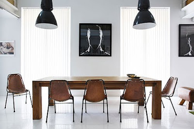
  • For dinner...think easy serving, suggestions...umm...name cards at each place setting...or a framed picture of the person to sit there...this can be a way to sit the mother in law on the other end of the table...far far away from you...if thats what you want...LOL! Try to incorporate coordinating dinnerware with the rest of the holiday decor. A plain white set of dinnerware is perfect and can be used for any occasion...Have all the appropriate serve-ware close by for the conversation to be ongoing with minimal interruptions...DON'T FORGET THE CANDLES....candle light flickering should be present on all surfaces and the entire foot print of the space. They instantly add warmth and evoke a feeling of invitation and relaxation of home. Make sure centerpieces are low enough to allow for conversation across the table yet are attractive and festive...a few poinsettias and sprinkled ornaments will do the trick..


This happens to be a dining table centerpiece a friend and I came up with for a holiday decorating class...I love it...it works so well...Who needs ideas for holiday centerpieces? I give this centerpiece 20 pts.!!

ENJOY YOURSELF and don't stress!!! All in all its a time to share with friends and family. If you can involve them in putting it all together great...just make sure you don't drain yourself to the point that you can't enjoy all your efforts.

oh...last thing...hostess gifts...perhaps ornaments they can choose directly off the tree...that can go further...
[design decorate do it yourself] until then...


Monday, July 5, 2010

iN nEED OF AN uPDATE!!! hOW ABOUT it!!


OVER TIME I REALIZE THAT WE ALL GET ACCUSTOMED TO WHAT WE HAVE. THOUGH IT MAY NOT BE WORN OR DISGUSTINGLY UGLY, WE NEED TO REALIZE THAT AN UPDATE IS IN ORDER IF YOU KNOW ITS BEEN IN YOUR OLD HOME AND NOW HAPPENED TO END UP IN AN EMPTY ROOM IN YOUR NEW HOME.

THAT WAS THE CASE WITH MY ONE OF MY PREVIOUS HOMES. THE FURNITURE I HAD WAS DATED...IT ALL SEEMED TO BE MONOTONE IN THE COLORS AND NOTHING MADE SENSE FOR THE SPACE. THE ROOM IS TECHNICALLY THE DEN OPEN TO THE KITCHEN. THE SPACE IS SMALL AND HAVING THE BIG AR MOIRE AND OVER STUFFED LEATHER SOFA BOTH FACING THE KITCHEN ALMOST MADE THE ROOM SEEM MORE LIKE A PASS THROUGH AND NOT A PLACE TO RELAX AND ENJOY. hEY i TRIED TO MAKE IT WORK...EVEN I GET STUCK SOMETIMES.

KNOWINGLY, I DECIDED TO MAKE A BIG IMPACT AND GIVE THIS GENERIC NEWER CONSTRUCTION TOWN HOME A FACE LIFT ROOM BY ROOM. WITH A BUDGET OF $3000 I BEGAN MY QUEST TO MAKE THE DEN AS COZY AND FUNCTIONAL FOR LOUNGING AND ENTERTAINING. THIS WAS WHERE I SPENT MOST OF MY TIME, A 12'X14' SPACE INSTEAD OF THE 23'X19' LARGE LIVING ROOM. I KNOW BACKWARDS...LOL. ANY HOW I LOOKED FOR A DRAMATIC COLOR SCHEME...DARK RICH TEAL WITH ESPRESSOS IVORY'S AND WHITES TO RETAIN SOME OF THE BRIGHTNESS THE DARK WALL WAS GOING TO SOAK UP. THE RESULT...
A RICH LOOKING SPACE WITH A SOPHISTICATION AND SIMPLISTIC ELEGANCE THAT INVITES EVERYONE TO KICK BACK AND RELAX. THE LOVE SEAT IN THE IVORY LEATHER PULL IN THE FLOORING AND THE LEAN LEGS ALLOW FOR THIS MID-CENTURY PIECE TO FEEL LIGHT IN THE SPACE AND LET US SEE THE PATTERN ON THE RUG. THE OTTOMAN ALLOWS FOR ADDITIONAL SEATING OR A PLACE TO PUT YOUR FEET UP FOR A CUP OF COFFEE OR TEA...GLASS OF WINE IF APPROPRIATE..LOL
I AM A HUGE ADVOCATE OF NATURAL DAYLIGHT. IF IT CAN POUR INTO A SPACE THAN LET IT BE. IT ALLOWS FOR SPACE TO FEEL LARGER. BLINDS BLINDS BLINDS PEOPLE...UHH..PLEASE LETS MOVE FORWARD AND AWAY FROM BECOMING SO OBLIVIOUS TO OPTIONS. THERE ARE SO MANY OPTIONS IN LIGHT FILTERING FOR A SPACE. DRAPERY... THE OLDEST OF ALL IS THE BEST WAY TO ADD INTEREST AND SOFTNESS TO A SPACE, THEY IMMEDIATELY GIVE A ROOM PRESENCE AND PRESTIGE NOT MATTER THE STYLING. BLINDS ARE ONLY APPROPRIATE IF YOUR SPACE IS JUST IRRITATINGLY BRIGHT. YET EVEN THEN, THERE ARE STAINED WOODEN BLINDS...NOT JUST WHITE PAINTED...SHADES..ETC. IN MY SPACE I WENT WITH A WHITE FLOOR TO CEILING GROMMETED DRAPERY IN A TWILL FABRIC. SIMPLE AND CLEAN. THE GROMMET ALLOWS THEM TO PULL AND OPEN EASILY.

THE ENTERTAINMENT UNIT WAS DESIGNED TO LOOK ALMOST CAMOUFLAGED AS IT WAS NOT TO BE THE FOCUS OF THE SPACE . THE TV WAS MOUNTED ON THE WALL AND FRAMES OF A SIMILAR SCALE FLANK BOTH SIDES. A FLOATING SHELF WAS USED AS A STOPPING POINT FOR THE EYE AND THEN A CONTINUOUS BROWN BLOCK WAS PAINTED BELOW TO THE BASEBOARDS TO HELP MAKE THE SMALLER END TABLES LOOK ALMOST INVISIBLE IN THE SPACE...THEY ARE SIMPLY IN THE SPACE TO HOLD THE RECEIVERS. THAT PROJECT WAS ABOUT $60 USING PAINT AND AN INEXPENSIVE SHELF AND TABLES FROM IKEA.


THESE WERE A STEAL AND A GREAT LOOK... ARMLESS SO AS TO NOT CLOSE THE SPACE IN AND THE TEXTURE WAS ON THE MARK, CORDUROY!!...WHO WOULD HAVE THOUGHT. A DARK ALMOST GRAY GREEN TIES BACK INTO THE AREA RUG AND THE TUFTS MIMIC THE ONES ON THE LOVE SEAT. pERFECT...$600...no!! $200 FOR THE PAIR.

i MUST SAY I LOVE THIS SPACE. SO GLAD I DID IT.

Sunday, July 4, 2010

Atlanta Town House goes NYC Bachelor Row-house Powder Room


I wanted the powder room to really have some dimension other than wall paper and paint. I did want to contrast the darkness of the spaces in the common living area as this room is between the kitchen and dining room. Keeping it simple yet dramatic with the wood application on the wall and a gloss finish paint make this 7ft x3ft room gain height and drama with places for the eye to pause.

The lighting is a simple fixture that is on a dimmer for ambiance and also only lights the sink area making the space even more dramatic. It also serves as a place for the mirror to hang from. This is my take on a 3k mirror for less than $40.
The blue metallic Ralph Lauren Paint is on the opposite wall and and up through the ceiling drawing the eye from the toilet to the focal wall again. Using colors still in the common area in different shades creates continuity and makes the space feel larger.
The Jewelry in a restroom is the fixtures and the accessories...the faucet has stoutly look which makes you think of raw piping and the vases with the orchids on the wall provide a simple touch to the wall for interest.


Saturday, July 3, 2010

Atlanta Town House goes NYC Bachelor Row-house


A bland new construction town home gets NYC character...

the picture molding and the choice of shades of gray instantly give this cookie cutter builder grade home a high end look. Thinking of the placement of furniture before installation also allowed for the molding to serve as guides for artwork and lighting. Testing colors in draping works well like a swatch of paint..hanging the drape for a day to see it over a day is a good way to hate it or love it.
The dining room the table had to be placed against the wall given the narrow space for the table and walkway. Using a counter height table with a square top gives the user ability to serve from it comfortably from 3 sides wen entertaining but also gives ample space to seat and dine 4 guests.
Add all accessories...frames ...art work...the space isn't big so all of them were chosen carefully making sure to add to the room and not engulf it.. off setting the darker grays of the sofa sectional and the walls with a soft beeswax yellow draping, ivory accent pillows to brighten, paired with blue smoke and striped yellow accent pillows for color...bring a little softness to a space that safely adds a feminine touch to a very masculine space.

Saturday, May 22, 2010

tHE dUMP..MY REVIEW


sO WE'VE ALL SEEN THE COMMERCIALS...aN OLD HOME DEPOT IN BUCKHEAD RENOVATED INTO A BIG OUTLET FURNITURE STORE... believe IT OR NOT THE DUMP IS ACTUALLY A GREAT PLACE TO FIND FURNITURE AND ACCESSORIES AT A DISCOUNT AND SOME PIECES ARE JUST THAT SPECIAL IT MAKES YOU WANT TO MAKE ROOM IN YOUR HOME WHEN YOU DONT HAVE ANY.

i FOUND THIS CHAIR ...ALL COW HIDE, MODERN, AND SO APPROPRIATE FOR MY LOFT...IT LIKE MANY OTHER PIECES ARE ALL RETURNED OR REFUSED ITEMS FROM FURNITURE RETAILERS AROUND THE WORLD THAT END UP AT PLACES LIKE THE DUMP...nO OPTIONS HERE, YOU GET WAT YOU SEE...tHE DRAW BACK IS THAT PAPER WORK FOLLOWS THE FURNITURE FROM THE ORIGINAL VENDOR AND SOME ITEMS ARE UNSELLABLE UNTIL THE PAPER WORK IS CLEARED...iM AWAITING THE CALL ...I NEED THAT CHAIR LOL...iLL KEEP YOU POSTED..

vISIT: www.thedump.com

wALK dOWN mEMORY LANE


sO I WAS LOOKING THROUGH MY DOODLES OVER TIME...THESE STRUCK ME AS SOME OF MY FAVORITE...NOTICE THEY ARE ALL VERY MODERN IN DESIGN WITH TONS OF GLASS. i ALSO LOOKED TO BE EXPERIMENTING WITH SITE AND SLOPE. cLERESTORY'S ARE ALSO TYPICAL IN MY TRAIN OF THOUGHT AT THAT TIME, BEING THAT IN CALIFORNIA LOTS WERE SMALL AND DAYLIGHTING THAT DIDNT GAIN YOU ACCESS TO YOUR NEIGHBORS INTERIORS WERE A DESIGN CONCERN.

mY FAVORITE ONE IS THE FIRST ONE ON THE SIDE OF THE HILL. I CAN TELL THEN I WASN'T TO GOOD AT PERSPECTIVE BUT IT HAS A FUN AND AMATEUR QUALITY TO IT THAT I REALLY LOVE AND APPRECIATE. THIS WAS LATE HIGH SCHOOL AND PROBABLY WAS A DOODLE DURING ONE OF THOSE CLASS PERIODS IN HIGH SCHOOL WHERE I LIVED IN A DREAM AND NOT IN THE MOMENT...sKETCHES REALLY ARE RECORDS OF THINGS THAT INSPIRE AND TAKE YOU ON A WALK DOWN MEMORY LANE.

WHeRE iT ALL cAME FROm... Deysi!!!

THIS BELIEVE IT OR NOT IS WHERE MY DESIRE TO BECOME AN ARCHITECT AND INTERIOR DESIGNER ALL CAME FROM. IT WAS MY CHILDHOOD HOME AND STILL MY FAMILIES CURRENT HOME IN LOS ANGELES. THIS CALIFORNIA 1927 SPANISH BUNGALOW WAS MY PROJECT IN THE MAKING OVER MY YOUNGER YEARS AND STILL SO IN THE PRESENT. IT WAS DURING RENO'S THAT I BEGAN TO DEVELOP THE DESIRE TO DESIGN AND SPACE PLAN AND ENVELOP MYSELF IN ALL THINGS DESIGN.

DRIVING AROUND THE MORE WELL TO DO NEIGHBORHOODS OF BEVERLY HILLS, LADERA HEIGHTS, AND ARCADIA OPENED MY EYES TO WHAT COULD BE IF ONLY WE APPLIED SOME TIME AND THOUGHT TO IT. oK...SO THE PAINT I CHOOSE LIKE 7 YEARS AGO...IT WAS A NICE GOLDEN SUNSET YELLOW BEFORE AND IT WILL PROBABLY GO BACK TO THAT AS SOON AS I GET MY MOM TO TRUST THAT ILL CHOOSE A NICE COLOR...THAT WAS THE WORST DECISION EVER...BUT ITS DONE...I THINK ITS TIME TO REPAINT. CANT REMEMBER MY THOUGHTS THEN BUT I ASSURE THE WORLD I WILL NEVER CHOOSE THAT PAINT COLOR AGAIN..


I DID GAIN MY PARENTS TRUST ENOUGH TO HAVE THEM ALLOW ME BEGIN RIPPING OUT OUR OLD NON FUNCTIONING KITCHEN, 3 DAYS BEFORE I MADE MY TRIP ACROSS THE COUNTRY TO BEGIN MY COLLEGE CAREER. JUST iMAGINE A DARK SANDSTONE COLORED PANELING WITH YELLOW STRIPES ALTERNATING FROM FLOOR TO CEILING... DARK CABINETS AND AVOCADO GREEN APPLIANCES. HIDEOUS RIGHT? i COULDN'T LEAVE BEFORE DOING SOMETHING ABOUT IT. I PLANNED THIS RENO ALL ALONE UNDER THE WATCHFUL EYE OF MY MOTHER DEYSI, KEEPING BUDGET IN MIND AND STAYING TRUE TO THE SPANISH STYLE. a SOLID STONE WAS NOT AT THE TIME CLOSE TO BEING AN OPTION SO i TOOK A SPANISH TILE AND RUST COLORED GROUT AND USED IT AS THE BACK SPLASH AND THE COUNTER TOP TO BRING SOME INTEREST TO SEA OF WHITE TILE.

aFTER CAREFULLY MEASURING THE ROOM AND THINKING OF THE THINGS MY MOTHER WOULD NEED TO MAKE HER LIFE EASIER, I THOUGHT TO LOOK INTO THE CABINET MAKER AND FOUND AN GREAT CHOICE WITHIN MY BUDGET. hAVE TO LOVE MY LATINOS FOR MAKING THIS POSSIBLE...LOL... I CHOSE A STAIN THAT WOULD HAVE SOME FUN LATIN HUES AND KEEP THE SPACE BRIGHT GIVEN I WAS LOSING 2 EAST FACING WINDOWS...WE ALSO ADDED A BEDROOM AND BATHROOM BEHIND THE KITCHEN WHICH CUT ALOT OF NATURAL LIGHT FROM THE SPACE. I DIDNT KNOW I WAS GONNA HAVE THE MOST TROUBLE WITH MY MAKESHIFT CLIENT[MOTHER]...DEYSI WAS COMPLETELY OPPOSED TO A DISHWASHER...I MEAN SHE WAS SERIOUS ABOUT NOT NEEDING ONE...AND TIL THIS DAY DOES NOT USE IT...ITS BECOME STORAGE LOL..

oNE OF THE MAJOR THINGS THAT I USED TO DESPISE WAS THE DIVIDED KITCHEN AND LIVING ROOMS. mY MOTHER IS A COOK OF ALL COOKS THAT WILL SERVE AND FEED EVERYONE BEFORE SHE SITS TO EAT HERSELF. wHEN ENTERTAINING IN THE OLD KITCHEN I REMEMBER EVERYONE TRYING TO CROWD IN THERE AND IT WOULD NOT BE POSSIBLE..OR EVERYONE WOULD BE IN THE DINING AND LIVING AREA AWAY FROM HER...SO I CHOSE TO OPEN THE WALL BEHIND THE STOVE WHICH WAS RECESSED IN THE DINING ROOM TO MAKE ROOM FOR A CHINA CABINET OR BUILT IN... IT WAS THE PERFECT PLACE FOR A BAR AND ACCENT LIGHTING. wORKS JUST AS I INTENDED IT TO. THE ONLY FLAW IS THE RANGE HOOD IS UP VERY HIGH AND SOMETIMES I THINK IT DOESN'T WORK EFFECTIVELY...EVEN AFTER ALL THE WORK TO CREATE A HOOD ENCLOSURE THAT WORKED WITH THE SCHEME.

aLL IN ALL MY INITIAL SKETCH TURNED OUT VERY SIMILAR TO THE ACTUAL THING... THE WASHER AND DRYER ENDED UP IN A CLOSET LIKE ENCLOSURE OFF TO THE SIDE RATHER THAN IN THE MIDDLE OF THE KITCHEN...I THINK THAT WAS BEST. USED SOME THRIFT STORE FINDS AND MADE A CUSTOM VALANCE THAT FINISHED OFF THE ACCESSORIES.

eVERYTIME I GO HOME I FALL IN LOVE WITH THIS SMALL KITCHEN. IT FUNCTIONS WELL...SPEAKS TO MY HERITAGE...AND WAS JUST WHAT DEYSI WANTED...I DESIGNED IT WITH HOPES THAT SHE WOULD FEEL COMFORTABLE AND WOULD BE ABLE TO CONTINUE TO DO WHAT SHE LOVES...BECAUSE IF YOU EVER TRIED HER FOOD YOU'D KNOW SHE NEEDED A KITCHEN TO WORK FOR HER BECAUSE THE RESULTS ARE SPECTACULAR.

i LOVE WHERE IT ALL CAME FROM!!!

Monday, May 17, 2010

MODERN is SO not boring!!

Just watching this video and listening to the music gives you this feeling of excitement and wanting to look into what modern design offers. Most always think modern to be concrete walls and blandness...NOT so. This video is a composition of particular homes in the Atlanta area that have been designed with the use architectural elements and primary forms to give them character and charm.

Ive been on a rampage to look for inspiration everywhere and not limit my sources. My loft is coming along slowly...I want to choose the best pieces to accentuate the all white planes and the exposed concrete ceilings. I'm not a big fan of color in a space like this but Ive been thinking about it. The video has a few good examples...

Monday, May 10, 2010

Projection Injection

AMAZING!!! I can say that this image is more than inspiring. Its projecting rectilinear elements are graphic and create texture and volume in the space. Its a bit futuristic and almost too dramatic to be to be a relaxing space but the thought and design is interesting.

It creates layers and the injection of lighting helps make them noticeable. The use of incandescents would help warm up the space. The fluorescents hinder it by making it look to office like. The most interesting thing is again the wall. I cant get over it. That speaks so much to what can be done when one thinks to use other methods of applications on the wall.

A BLOCK Away

I think in looking at this facade i love the subtle detailing in the rectangular elements and how it is the opposite of the natural scape in the background. It is however the very essence in a building that defines the personality of the inhabiter. One can see the persons personality and how strong they believe in being comfortable at home.

The mix in materials used along with the colors used, make the passer by understand the importance for the delineation of colors textures and materials. They provide a warm yet cool feeling that also give hierarchy to the doors and windows. It provides harmonious contrast not to mention your drawn to it by just how interesting it is.

Monday, April 26, 2010

AIR boRN


My flight back to Atlanta from Los Angeles was busy and all over the place.. I played event planner, computer tech, and a full time uncle. Though I did not get to rest and may not have gotten all my responsibilities taken care of, this view at about the last 20 minutes of my flight back to atlanta really made me think of comfort in spaces.

Granted the plane interiors weren't the most accommodating, they worked well. This vista left me in aww...The comfort and softness makes makes me want to carry over that into my project in my home. I want it to be lux yet very comfortable. Lets make it happen.

Sunday, April 18, 2010

WOOD Be Logs


Throughout this process of searching for objects and materials to help get my new loft look and feel special and luxe, i have been on the prowl for new ideas and materials. Ive looked into so many ways to try to add custom charm to a space that is not so rich in character. As I drove up 400 yesterday, I thought to myself I really need textured walls for my Master bath to add interest into a boring smooth surfaced space. Paint though cheap just is bland and not creative and breath taking....So I Googled it on my phone...yes while driving...I know bad...anyway I found these pictures and they really attracted me. It was not the look of the spaces but that natural organic looking wall that is magnificent.

I love it. LOOOVVE IT!! I want it for my space. It has a textural quality that will add dimension and an added bonus is the price...I think ill be visiting the wood shop with a pile of fire wood from the grocery store...Im looking for cheap but not ugly..Time to roll up the sleeves and get to work...ALL this time searching and it WOOD be LOGS!!

Monday, April 12, 2010

MY INSPIRATION BATHROOM!!!

The mixtures of finishes and the textures of the finishes are so sleek and fine lined. It makes the space feel bigger, open, clean and airy. The brown on the walls makes it a masculine space, yet the linear elements make it feminine yet appropriate for the space. I love the boundries that this space has broken. People usually think of a small space with no windows to be painted in a light color, this space has proven to show how dramatic and cavelike a space can be with a dark rick color on all four planes of a room.

I am excited beacuse I was looking for an image of somesort that i could gain inspiration for my master bath in my loft. I will take some ideas from this, one being the color and add a textured wall in crispy linen white to create voloume and shadows in a space that is so sleek. I will post the result once im close to done. A space is only as great as the research one does. LOVE THIS BATHROOM.

Sunday, April 4, 2010

REUSE REUSE REUSE


ONE DAY AGAIN JUST SURFING THE NET, I CAME ACROSS THIS PICTURE. IT REALLY DREW ME TO IT BECAUSE OF THE MINIMALISTIC QUALITY OF THE FURNITURE AND ACCESSORIES. ALL THE PIECES ARE LOADED WITH CHARACTER AND SOME ALSO HAVE A TOUCH OF AGE ( OR AT LEAST LOOK LIKE THEY DO).


ON A RANDOM EXCURSION TO THE ATLANTA'S DOWNTOWN SALVATION ARMY, I RAN INTO THIS BEAUTIFUL ADJUSTABLE TRIPOD LAMP WITH AGED BRASS METAL FITTINGS THAT LOOKED TO BE FROM THE 40'S OR 50'S. TRUE AUTHENTICITY AND HISTORY AT $60, IN COMPARISON TO SIMILARLY STYLED LAMPS AVAILABLE AT RETAIL FURNITURE STORES AND HIGH END SHOPS STARTING AT $300 AND UP. WHAT A STEAL...I MUST HAVE IT AND REUSE IT. A GREAT SUSTAINABLE ADDITION TO MY LOFT.

The Beginning of a Great New Home


SO FOR THE DEBUT POST, IVE DECIDED TO USE MY RECENT HOME AS THE MOTIVATOR FOR INSPIRATION, AS ITS BEEN SINCE I MOVED IN LESS THAN TWO MONTHS AGO. THE PICTURE ALONE EXPLAINS THE DESPERATE NEED FOR A RENO BEFORE ANYTHING ELSE CAN BE ADDRESSED. A SPACE THAT CREATES AN EXPERIENCE, EXUDES THOUGHTFUL DESIGN, BUDGET, AND HAS COMFORTABLE HIGH END LOOK FOR A MALE IS THE GOAL.


IN MY SEARCH TO FIGURE OUT AN OVER ALL FEEL FOR THE SPACE, I RAN ACROSS THIS PICTURE ONLINE. THE USE OF WHITE AS A BACKGROUND COLOR ON ALL PLANES OF THE ROOM IS REALLY INTERESTING. IT ALLOWS THE FURNISHINGS AND FIXTURES TO DISPLAY THEIR MOST INTERESTING QUALITIES WHICH MAKES ONE REALLY APPRECIATE THE CHARM AND CHARACTER THEY ALL ADD INTO THE SPACE. I PARTICULARLY WAS TAKEN BY THE WHITE CONCRETE FLOOR. THE HIGH GLOSS PAINTED FLOOR IN THIS PICTURE MAKES THE FLOOR LOOK LIKE
MARBLE OR OTHER EXPENSIVE STONE FLOOR FINISHES, YET AT A SIGNIFICANTLY LOWER PRICE. PERFECT FOR MY APPLICATION!!!