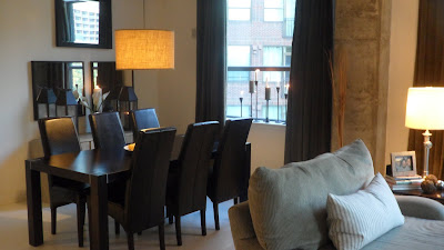
In its original state, the dining room said first time home buyer mistakes 101. With several DIY projects and smart shopping the dining room is one of my least expensive rooms, but delivers great impact. With most city dwellings, storage is usually short of being enough. With a relatively smaller kitchen, the pieces used in the dining space had to have multiple functions. Re-purposing an old credenza using a paint treatment added storage and little to be drawn from the bank. The light fixture is a $10 drum shade...add a polished nickel canopy and a light kit and the table is now dressed with a warm glow for an enjoyable meal all at $30. Whats a space without drinks? I had an old armoire that I did not have any use for. I threw out my last box TV once I moved but with a little elbow grease, paint, tile mirrors, and imagination it is now a great bar cabinet that stores glasses has serving space and tons of storage space below. Great use for such a large piece! All the furniture is simple and clean for a modern feel. For information on how to achieve any of the re purposed furniture send questions to dantodesigns@gmail.com .
Before
After
Friday, October 7, 2011
Sunday, September 25, 2011
Downtown Atlanta Loft - Living Room Reveal
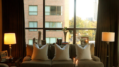
The first blog I ever wrote began with the first image below. This image captures the first visit to my loft and the time I knew it had to be mine. It was not much to look at then, however with a plan and the ultimate vision, I used pieces from my previous home, and layered in new and re-purposed pieces to reach this result. A ton of bargain shopping, lots of paint, tons of sweat and elbow grease, and a couple of months later...reveals a designers lofty living room in the heart of Atlanta, Georgia...
Before
The Transformation
Walls and Trim - Crisp Linen Flat and Semi-Gloss Americas Finest by Glidden Paint
Floors - Crisp Linen Oil Based Porch Paint by Glidden
Available at www.homedepot.com
After
More rooms to come....
Before
The Transformation
Walls and Trim - Crisp Linen Flat and Semi-Gloss Americas Finest by Glidden Paint
Floors - Crisp Linen Oil Based Porch Paint by Glidden
Available at www.homedepot.com
After
More rooms to come....
Monday, December 13, 2010
Entertaining for the Holiday's...How to make the most of it..
What a way to create such a dramatic entrance for the holiday's!! Now though this is strong a statement, you may not want to have fragile ornaments on stairs especially once the bubbly has been poured. Without a doubt, its an exciting image that you'll never forget...makes you jealous doesn't it?
With that thought in mind...Entertaining for the holidays is usually a great way to exhibit your skills in the kitchen, and with decor, by hosting with hopes to create a wonderful memorable experience with those you love.To begin we need to sit down and grab a pen and paper and jot down a few things:
- When entertaining you need to figure out what it is that you want to showcase, and how you plan to do so. Begin with the theme, number of guest, and the menu based on the likes and dislikes of the possible guest.
- Once the theme is chosen...Send and invite. If you are tech savvy make a digital invitation, most times its an easier way to check reservations of those attending, easy to design an invite and lets face it...its less waste and efficient. If you would rather send a card think of something cute simple festive and even handmade. It must communicate the theme whether it carries the color palette of the decor or something that is to be represented on the day of the event. Give yourself enough time to send them out and get a response from your guest in-case somethings need to be reworked.
- Plan the menu...there is nothing like great food good company and a great glass of wine. Be aware of all your guests, if you are planning a smaller gathering look to add a dish that relates to each one of the guest attending...this will surly make you the most caring and attentive friend or family member. + 10pts.!!
- Once you've assembled that part of the puzzle...lets tackle the decoration. This is what matters most to make the space inviting and worth remembering...Based on your initial planning, choose 2 or 3 colors that you want to use through out the space. Keep in mind your existing color scheme in the space. This keeps the space from looking like a disarray of mis-matched decoration. Now build your inventory...I like to go to a local discount store and buy my inexpensive ornaments in solid finishes and several different sizes. I then add a few of my more pricey ornaments here and there in a contrasting finish. Don't forget ribbon wrapping paper in coordinating colors and textures and greenery. All these things grouped on the mantle, under the tree, console, or hanging off a chandelier make warmer more inviting spaces for the holidays. Using assorted box sizes wrapping paper and ribbon make for more inexpensive decoration that will fill up the bare areas of the space. If stacked in an interesting manner they give the allusion of a person that is giving...This is also a great time to get creative with your existing things.
- Look into what you own that can showcase a special something for the guests. This picture wreath could be special memories for that entire year, it could be pictures of all the guest, or simply something directly related to you. This is a great simple and elegant manner of decorating for the holiday. Then lets take a trip in the yard...clip some holly berries, gather pine cones, branches, pine clippings, and fill a glass bowl or place them around the room. This idea gives a custom look to your decor and also may bring in scents of the outdoors into the house such as the pine that reminds us that "tis the season." +15pts.
- For dinner...think easy serving, suggestions...umm...name cards at each place setting...or a framed picture of the person to sit there...this can be a way to sit the mother in law on the other end of the table...far far away from you...if thats what you want...LOL! Try to incorporate coordinating dinnerware with the rest of the holiday decor. A plain white set of dinnerware is perfect and can be used for any occasion...Have all the appropriate serve-ware close by for the conversation to be ongoing with minimal interruptions...DON'T FORGET THE CANDLES....candle light flickering should be present on all surfaces and the entire foot print of the space. They instantly add warmth and evoke a feeling of invitation and relaxation of home. Make sure centerpieces are low enough to allow for conversation across the table yet are attractive and festive...a few poinsettias and sprinkled ornaments will do the trick..
This happens to be a dining table centerpiece a friend and I came up with for a holiday decorating class...I love it...it works so well...Who needs ideas for holiday centerpieces? I give this centerpiece 20 pts.!!
ENJOY YOURSELF and don't stress!!! All in all its a time to share with friends and family. If you can involve them in putting it all together great...just make sure you don't drain yourself to the point that you can't enjoy all your efforts.
oh...last thing...hostess gifts...perhaps ornaments they can choose directly off the tree...that can go further...
[design decorate do it yourself] until then...
Monday, July 5, 2010
iN nEED OF AN uPDATE!!! hOW ABOUT it!!
OVER TIME I REALIZE THAT WE ALL GET ACCUSTOMED TO WHAT WE HAVE. THOUGH IT MAY NOT BE WORN OR DISGUSTINGLY UGLY, WE NEED TO REALIZE THAT AN UPDATE IS IN ORDER IF YOU KNOW ITS BEEN IN YOUR OLD HOME AND NOW HAPPENED TO END UP IN AN EMPTY ROOM IN YOUR NEW HOME.
THAT WAS THE CASE WITH MY ONE OF MY PREVIOUS HOMES. THE FURNITURE I HAD WAS DATED...IT ALL SEEMED TO BE MONOTONE IN THE COLORS AND NOTHING MADE SENSE FOR THE SPACE. THE ROOM IS TECHNICALLY THE DEN OPEN TO THE KITCHEN. THE SPACE IS SMALL AND HAVING THE BIG AR MOIRE AND OVER STUFFED LEATHER SOFA BOTH FACING THE KITCHEN ALMOST MADE THE ROOM SEEM MORE LIKE A PASS THROUGH AND NOT A PLACE TO RELAX AND ENJOY. hEY i TRIED TO MAKE IT WORK...EVEN I GET STUCK SOMETIMES.
KNOWINGLY, I DECIDED TO MAKE A BIG IMPACT AND GIVE THIS GENERIC NEWER CONSTRUCTION TOWN HOME A FACE LIFT ROOM BY ROOM. WITH A BUDGET OF $3000 I BEGAN MY QUEST TO MAKE THE DEN AS COZY AND FUNCTIONAL FOR LOUNGING AND ENTERTAINING. THIS WAS WHERE I SPENT MOST OF MY TIME, A 12'X14' SPACE INSTEAD OF THE 23'X19' LARGE LIVING ROOM. I KNOW BACKWARDS...LOL. ANY HOW I LOOKED FOR A DRAMATIC COLOR SCHEME...DARK RICH TEAL WITH ESPRESSOS IVORY'S AND WHITES TO RETAIN SOME OF THE BRIGHTNESS THE DARK WALL WAS GOING TO SOAK UP. THE RESULT...
A RICH LOOKING SPACE WITH A SOPHISTICATION AND SIMPLISTIC ELEGANCE THAT INVITES EVERYONE TO KICK BACK AND RELAX. THE LOVE SEAT IN THE IVORY LEATHER PULL IN THE FLOORING AND THE LEAN LEGS ALLOW FOR THIS MID-CENTURY PIECE TO FEEL LIGHT IN THE SPACE AND LET US SEE THE PATTERN ON THE RUG. THE OTTOMAN ALLOWS FOR ADDITIONAL SEATING OR A PLACE TO PUT YOUR FEET UP FOR A CUP OF COFFEE OR TEA...GLASS OF WINE IF APPROPRIATE..LOL
I AM A HUGE ADVOCATE OF NATURAL DAYLIGHT. IF IT CAN POUR INTO A SPACE THAN LET IT BE. IT ALLOWS FOR SPACE TO FEEL LARGER. BLINDS BLINDS BLINDS PEOPLE...UHH..PLEASE LETS MOVE FORWARD AND AWAY FROM BECOMING SO OBLIVIOUS TO OPTIONS. THERE ARE SO MANY OPTIONS IN LIGHT FILTERING FOR A SPACE. DRAPERY... THE OLDEST OF ALL IS THE BEST WAY TO ADD INTEREST AND SOFTNESS TO A SPACE, THEY IMMEDIATELY GIVE A ROOM PRESENCE AND PRESTIGE NOT MATTER THE STYLING. BLINDS ARE ONLY APPROPRIATE IF YOUR SPACE IS JUST IRRITATINGLY BRIGHT. YET EVEN THEN, THERE ARE STAINED WOODEN BLINDS...NOT JUST WHITE PAINTED...SHADES..ETC. IN MY SPACE I WENT WITH A WHITE FLOOR TO CEILING GROMMETED DRAPERY IN A TWILL FABRIC. SIMPLE AND CLEAN. THE GROMMET ALLOWS THEM TO PULL AND OPEN EASILY.
THE ENTERTAINMENT UNIT WAS DESIGNED TO LOOK ALMOST CAMOUFLAGED AS IT WAS NOT TO BE THE FOCUS OF THE SPACE . THE TV WAS MOUNTED ON THE WALL AND FRAMES OF A SIMILAR SCALE FLANK BOTH SIDES. A FLOATING SHELF WAS USED AS A STOPPING POINT FOR THE EYE AND THEN A CONTINUOUS BROWN BLOCK WAS PAINTED BELOW TO THE BASEBOARDS TO HELP MAKE THE SMALLER END TABLES LOOK ALMOST INVISIBLE IN THE SPACE...THEY ARE SIMPLY IN THE SPACE TO HOLD THE RECEIVERS. THAT PROJECT WAS ABOUT $60 USING PAINT AND AN INEXPENSIVE SHELF AND TABLES FROM IKEA.
THESE WERE A STEAL AND A GREAT LOOK... ARMLESS SO AS TO NOT CLOSE THE SPACE IN AND THE TEXTURE WAS ON THE MARK, CORDUROY!!...WHO WOULD HAVE THOUGHT. A DARK ALMOST GRAY GREEN TIES BACK INTO THE AREA RUG AND THE TUFTS MIMIC THE ONES ON THE LOVE SEAT. pERFECT...$600...no!! $200 FOR THE PAIR.
i MUST SAY I LOVE THIS SPACE. SO GLAD I DID IT.
Sunday, July 4, 2010
Atlanta Town House goes NYC Bachelor Row-house Powder Room
I wanted the powder room to really have some dimension other than wall paper and paint. I did want to contrast the darkness of the spaces in the common living area as this room is between the kitchen and dining room. Keeping it simple yet dramatic with the wood application on the wall and a gloss finish paint make this 7ft x3ft room gain height and drama with places for the eye to pause.
The lighting is a simple fixture that is on a dimmer for ambiance and also only lights the sink area making the space even more dramatic. It also serves as a place for the mirror to hang from. This is my take on a 3k mirror for less than $40.
The blue metallic Ralph Lauren Paint is on the opposite wall and and up through the ceiling drawing the eye from the toilet to the focal wall again. Using colors still in the common area in different shades creates continuity and makes the space feel larger.
The Jewelry in a restroom is the fixtures and the accessories...the faucet has stoutly look which makes you think of raw piping and the vases with the orchids on the wall provide a simple touch to the wall for interest.
Saturday, July 3, 2010
Atlanta Town House goes NYC Bachelor Row-house
A bland new construction town home gets NYC character...
the picture molding and the choice of shades of gray instantly give this cookie cutter builder grade home a high end look. Thinking of the placement of furniture before installation also allowed for the molding to serve as guides for artwork and lighting. Testing colors in draping works well like a swatch of paint..hanging the drape for a day to see it over a day is a good way to hate it or love it.
The dining room the table had to be placed against the wall given the narrow space for the table and walkway. Using a counter height table with a square top gives the user ability to serve from it comfortably from 3 sides wen entertaining but also gives ample space to seat and dine 4 guests.
Add all accessories...frames ...art work...the space isn't big so all of them were chosen carefully making sure to add to the room and not engulf it.. off setting the darker grays of the sofa sectional and the walls with a soft beeswax yellow draping, ivory accent pillows to brighten, paired with blue smoke and striped yellow accent pillows for color...bring a little softness to a space that safely adds a feminine touch to a very masculine space.
Subscribe to:
Posts (Atom)